Making a small room feel bigger isn’t just about knocking down walls.
With the right colors, you can trick the eye into perceiving a more spacious and airy environment. Subtle hues and smart tonal choices can breathe life into compact spaces, transforming them into cozy, inviting areas you’ll love.
Here, I’m sharing my favorite colors to make any tiny space feel larger, brighter, and more inviting. Let’s dive in!
Why Colors Matter in Small Spaces
Here’s the deal: colors trick the eye. Some shades retract, making walls feel like they’re almost leaning away from you—yeah, kind of like a bad blind date.
Others? Ugh, they close in on the space like a tight hug from your overly affectionate aunt. Choosing the right color palette can exaggerate light, create depth, and—voila!—the space feels bigger.
Colors can also affect mood, which is crucial in small spaces. The wrong palette can turn a cozy corner into a place that screams, “Get me out of here!” while the right selection will have you happily binge-watching Netflix in peace.

1. Mint Green
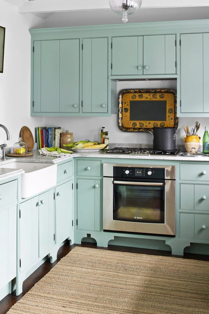
I love how mint green breathes life into small spaces! It’s soft, cheerful, and reflects light like magic.
We painted our kitchen cabinets mint green, and they instantly made the room feel fresh and spacious. The gentle hue blends beautifully with white walls and jute rugs.
If you’re hesitant, start with a small section—cabinets, maybe—and pair with neutral tones for balance.
2. Crisp White
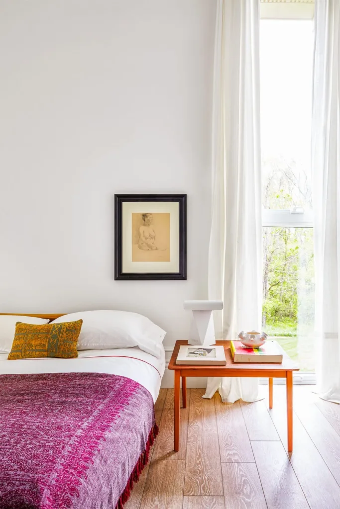
Crisp white is honestly my secret weapon for tight spaces. It opens up any room instantly.
I painted my guest bedroom white, just like the picture here, and added sheer curtains for a layered, airy effect. It’s so versatile for any decor!
Need a tip? Add pops of personality with colorful throws or cushions to keep the space from feeling too plain.
3. Pale Gray
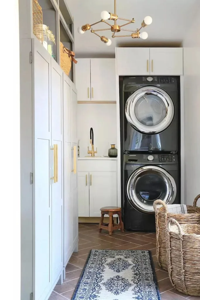
Pale gray knows how to balance elegance with simplicity perfectly. It’s a soft neutral that still stands out.
I have it in my laundry room—the way it draws in light and complements storage details like baskets is amazing.
Pair it with gold accents or natural wood to give your small rooms a polished, cozy vibe without overwhelming the space.
4. Sage
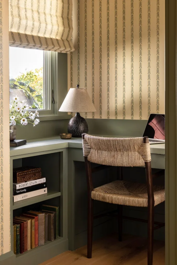
Sage is calming, yet it gives any small corner so much depth—it’s a personal favorite for offices.
I tried it in my reading nook, and the muted green instantly made the space feel serene without feeling dull.
Want a great combo? Sage pairs perfectly with textures like woven chairs, warm woods, or even some bold patterned pillows.
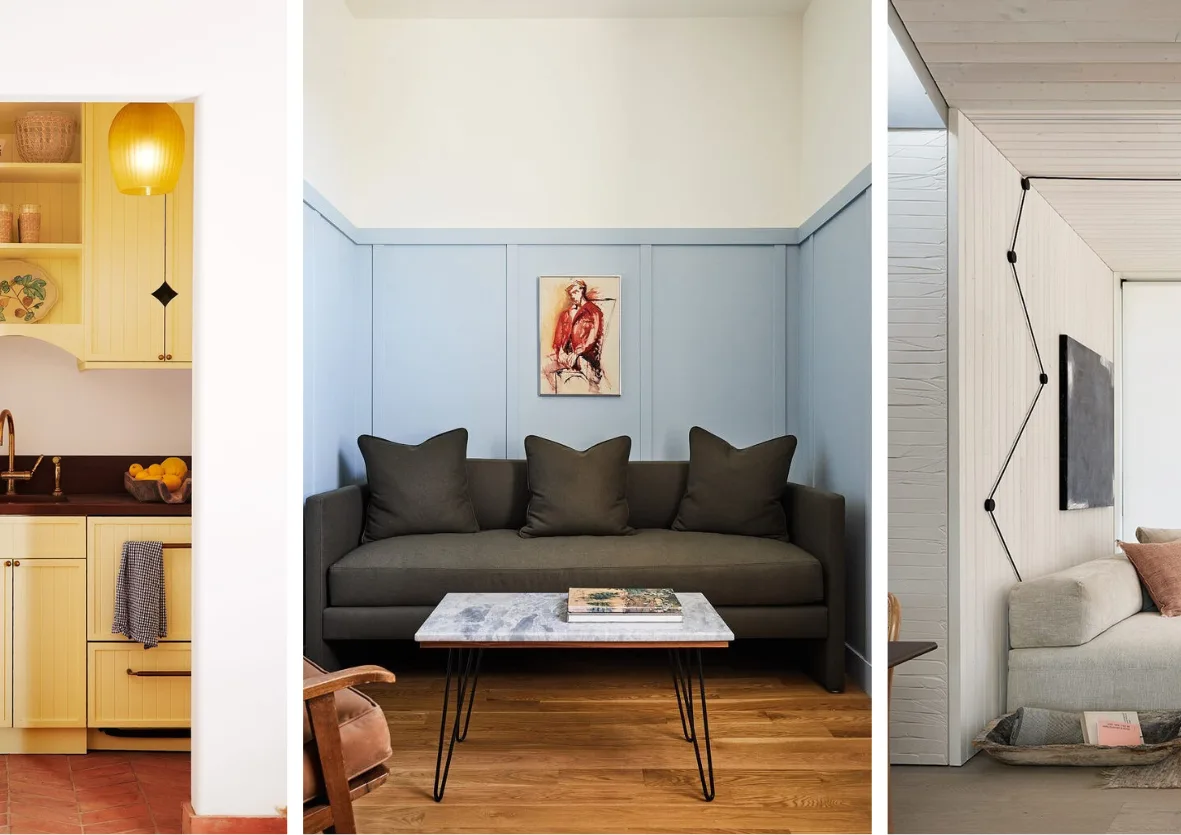
5. Sky Blue
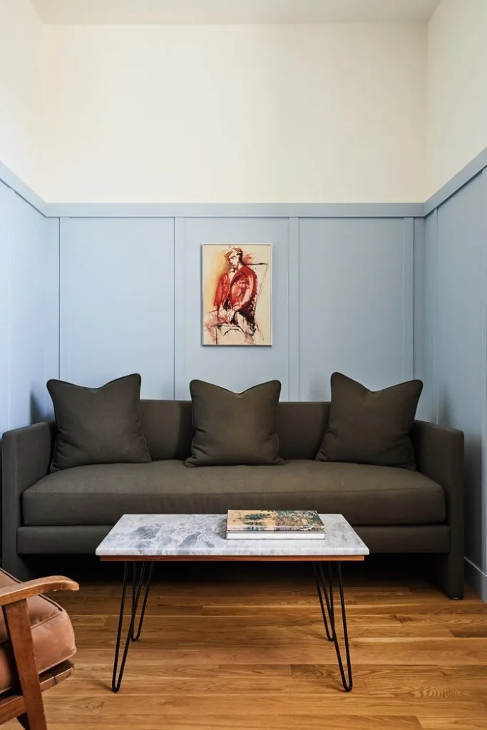
Sky blue made my living room feel like it gained miles of empty sky—no joke, it’s that impactful!
This hue softens the walls and tricks the eye into seeing more light and space. Plus, it’s great for pairing with darker furniture like this setup.
My advice? Use sky blue in rooms that feel shadowy. It reflects light beautifully and always creates a fresh look.
6. Pure White
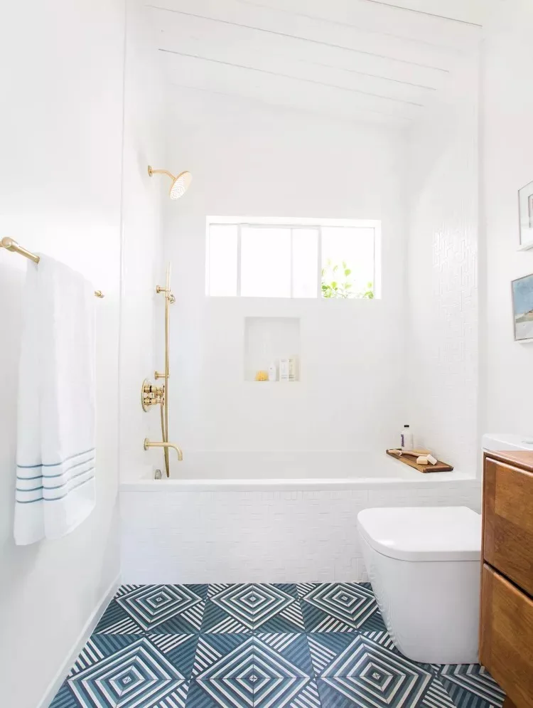
Pure white transformed my bathroom into a spa-like retreat. This color works miracles in tight spaces.
By reflecting light and blending walls seamlessly, it stretched the room visually. I love pairing it with patterned floors, like in this image, for extra personality.
Not into glossy finishes? Try matte paint for a softer, more natural feel. It’s timeless.
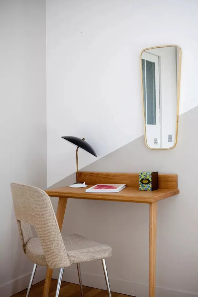
7. Light Gray-Blue
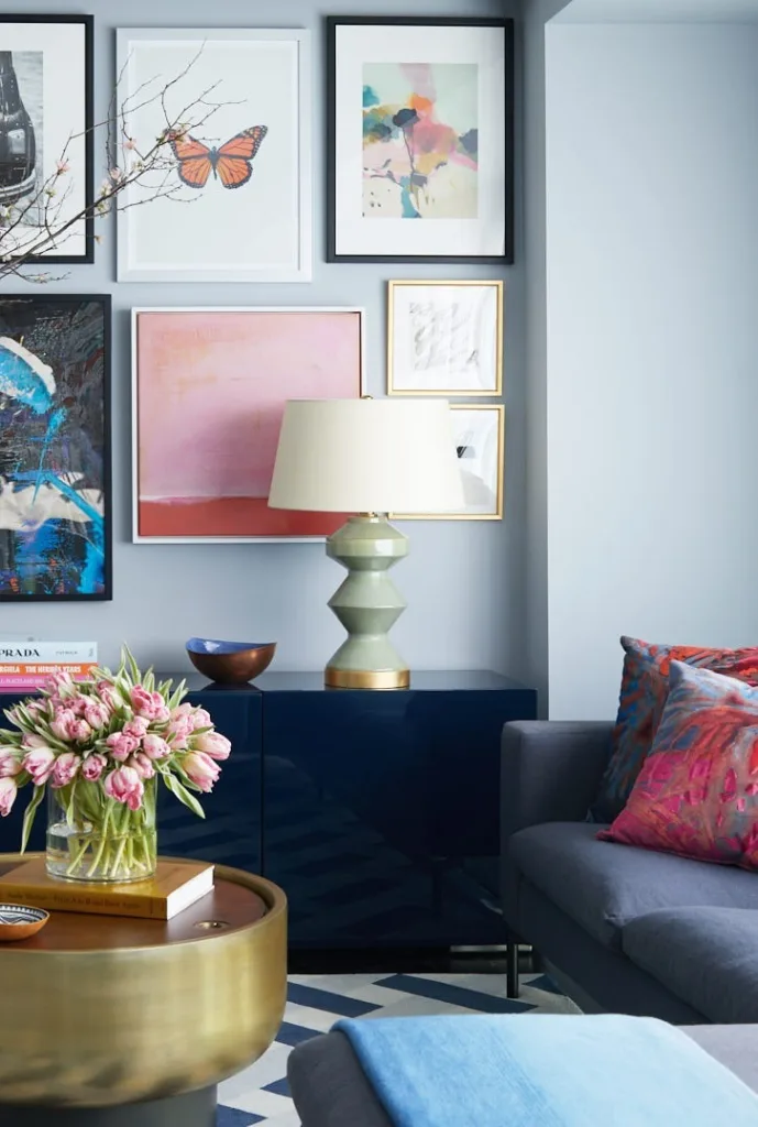
This light gray-blue hue feels effortlessly classy and quietly expansive—it’s subtle, yet it leaves an impression.
I used it in my guest room, and layering decor like gallery walls or colorful throws felt simple and cohesive. The walls fade beautifully into the background.
If you’re into cool tones but want warmth too, this shade is your go-to pick.
8. Greige
I’ll admit, greige (that perfect mix of gray and beige) is my safety net for small spaces. It’s so adaptable!
We used it in a hallway, and it worked wonders by softening harsh lighting and warming up the area.
Pair greige with anything—woodsy tones, whites, or even darker accents. It’s cozy without feeling overwhelming.
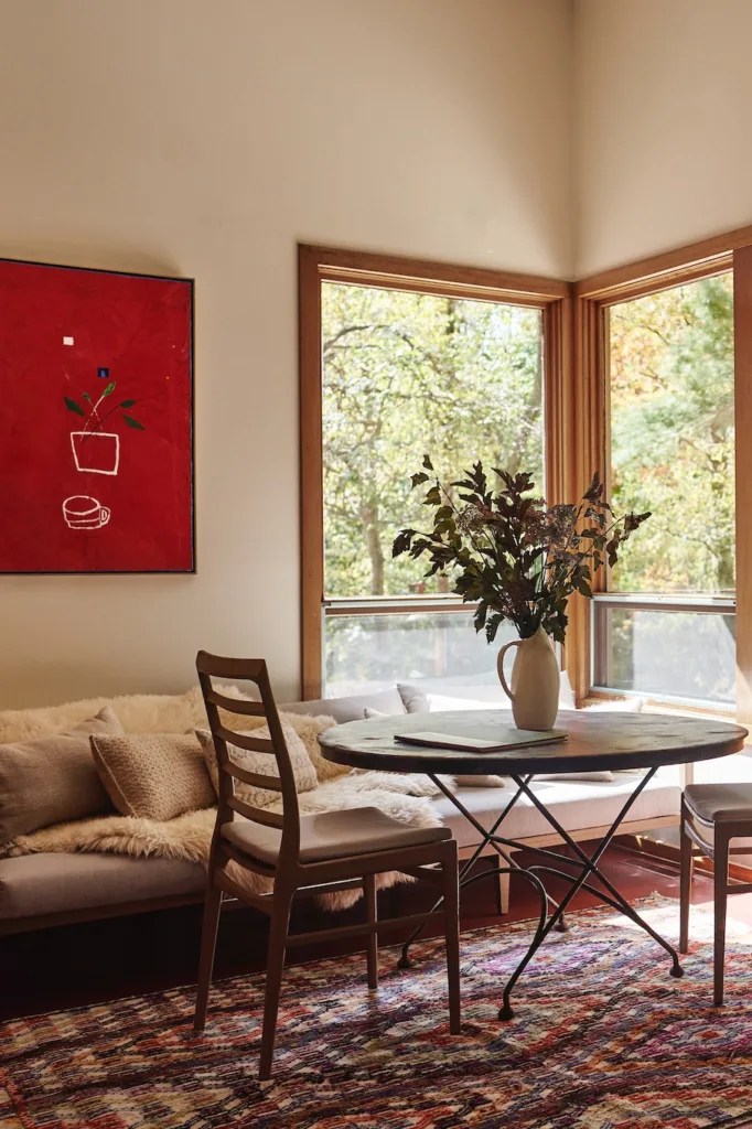
9. Soft Blonde
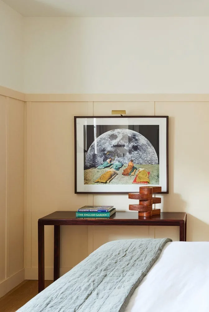
Soft blonde shades bring a gentle warmth to dim corners—perfect for when you want a hint of glow.
In our dining nook, the creamy hue worked brilliantly with natural woods and woven textiles. It gives that airy, rustic vibe.
The trick? Add light-colored accents and a hint of gold here and there to balance it perfectly.
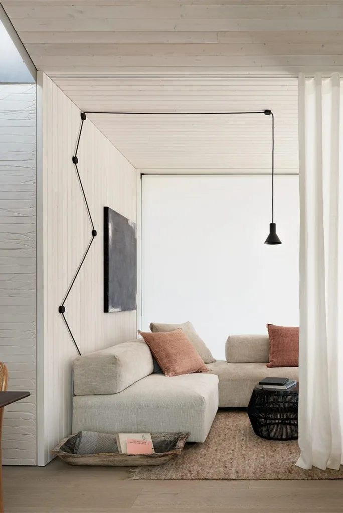
10. Soft Black
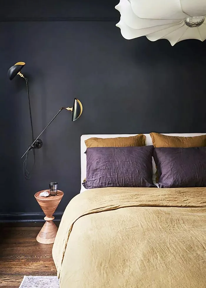
Soft black was surprisingly transformative for our accent wall. It added depth without eating up space!
Like in this photo, I paired it with lighter furniture and bedding, which popped beautifully against the dark wall.
This shade shines in areas where you want mood and intimacy—like cozy bedrooms or chic dens.
11. Flat White
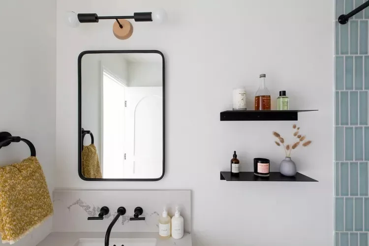
Flat white is my choice when I need simplicity without the gloss. It’s calm, soft, and oh-so-classy.
I’ve seen it shine in bathrooms, like this one, creating clean lines that draw the eye upward effortlessly.
To enhance the flat finish, keep the decor minimal—slick black fixtures or wood accents work wonders!
12. Blush Pink
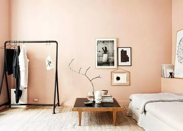
Blush pink isn’t just trendy—it’s timeless! When we used it in my daughter’s room, the warmth made the space feel extra inviting.
This shade works best with neutral decor and soft textures like cream throws and woven rugs.
If you’re thinking pink but don’t want it overwhelming, keep the furnishings sleek to balance the tone.
13. Dark Green
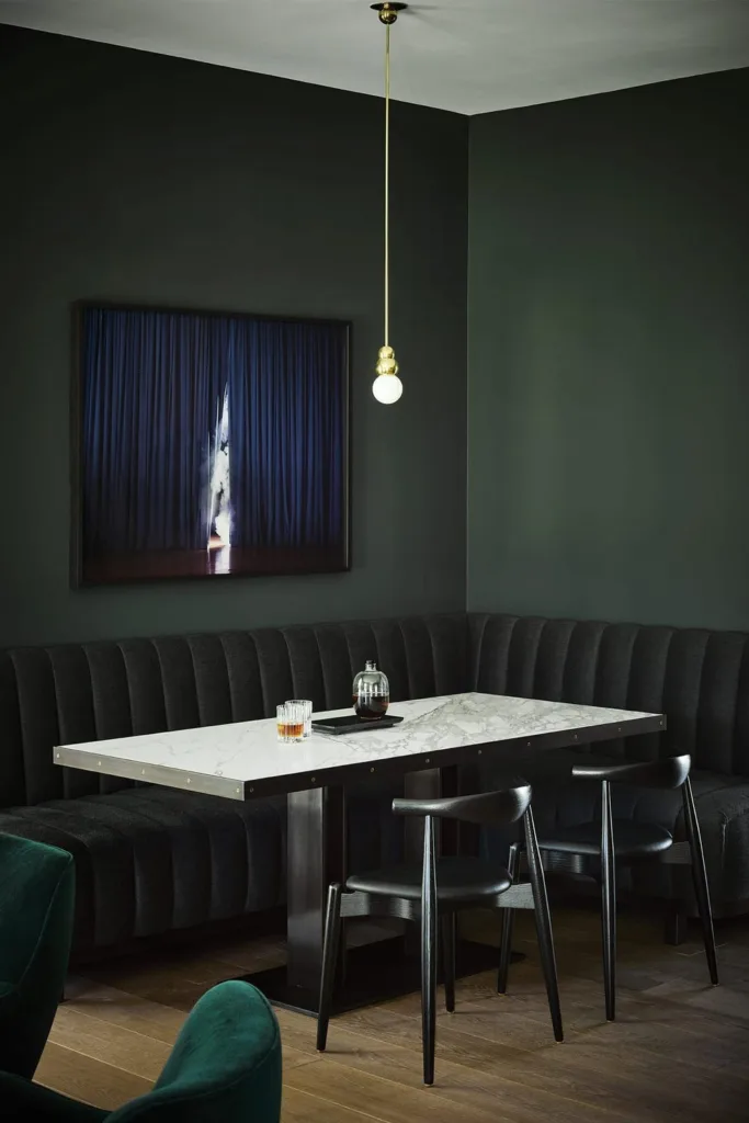
Dark green makes such a bold statement—it’s perfect for dining areas. It creates instant drama and depth.
We paired it with white and marble, as shown here, and kept the furniture simple for contrast.
My favorite thing about this color? It feels luxurious without being overpowering, even in small spaces.
14. Pastel Yellow
Pastel yellow is the color of happiness, I swear! When I popped it into my kitchen’s cabinets, it warmed up the space beautifully.
It reflects natural and artificial light, making rooms feel bigger and cheerier—such a win for tight spaces!
Bonus tip? Pair it with white or wood details to keep it balanced and not overly bright.
15. Antique White
There’s something about antique white that feels comforting, cozy, and timeless all at once.
I used it in my breakfast corner, and it paired perfectly with natural light and rustic wood furniture.
If you want something softer than modern whites, antique white is your perfect middle ground for warmth and versatility.
16. Light Beige
Light beige is deceptively simple—one of those shades you underestimate until it’s on the wall.
I painted our den this color, and it gave the space a calm, neutral base that worked with absolutely everything.
This shade pairs well with textured throws, earthy decor, or a little pop of black to ground it.
Conclusion
You don’t need to tear down walls to make a small room feel bigger! From soft whites to bold greens, the right color can completely transform how your space feels.
Start small—maybe just an accent wall or some cabinets—and work your way up. Trust me, once you see the difference, you’ll want to pick up that paintbrush again and again.
What color will you try? Let me know!