Okay, real talk, your front door? It’s the first impression your home makes.
Whether you’ve got a cute cottage, a sleek modern build, or something in between, that door sets the tone.
And picking the right front door color? It can seriously elevate your whole vibe.
Let’s chat about 24 fun, fresh, and realistic front door colors that will make your neighbors do a double take.
Why Front Door Colors Matter More Than You Think
You know that feeling when you walk up to someone’s house and their front door just pops? It tells a little story.
Your door color isn’t just paint, it’s personality, welcome energy, and sometimes even resale value all rolled into one.
Here’s why your door color is a big deal:
- Instant curb appeal, it’s the focal point of your exterior.
- Mood setting, warm colors feel cozy, cool ones feel calm.
- Reflects your style, from bold to classic to quirky, it speaks volumes.
Honestly, I didn’t realize how much my old faded beige door was dragging everything down until I switched to a moody navy. Game. Changer.
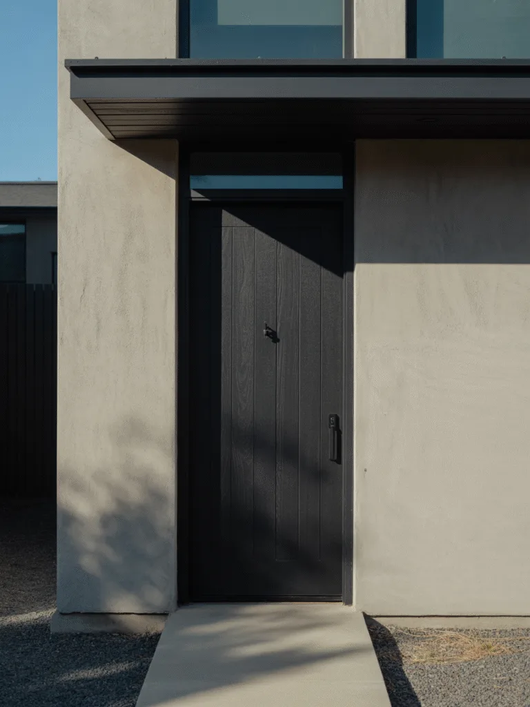
1. Classic Black
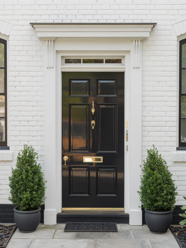
There’s something undeniably sharp about a black front door. It’s timeless, bold, and goes with literally everything. If you’re not ready for a wild color but want something that feels intentional, black is your best friend.
Why black doors work:
- Instant sophistication, makes the whole facade look crisp.
- Pairs with everything, brick, stone, white, you name it.
- Low-maintenance, hides dirt better than lighter colors.
Design Tips:
- Add brass or gold hardware for a luxe touch.
- Pair with a white or gray exterior for strong contrast.
- Keep your trim clean and sharp to let the black pop.
2. Moody Navy Blue
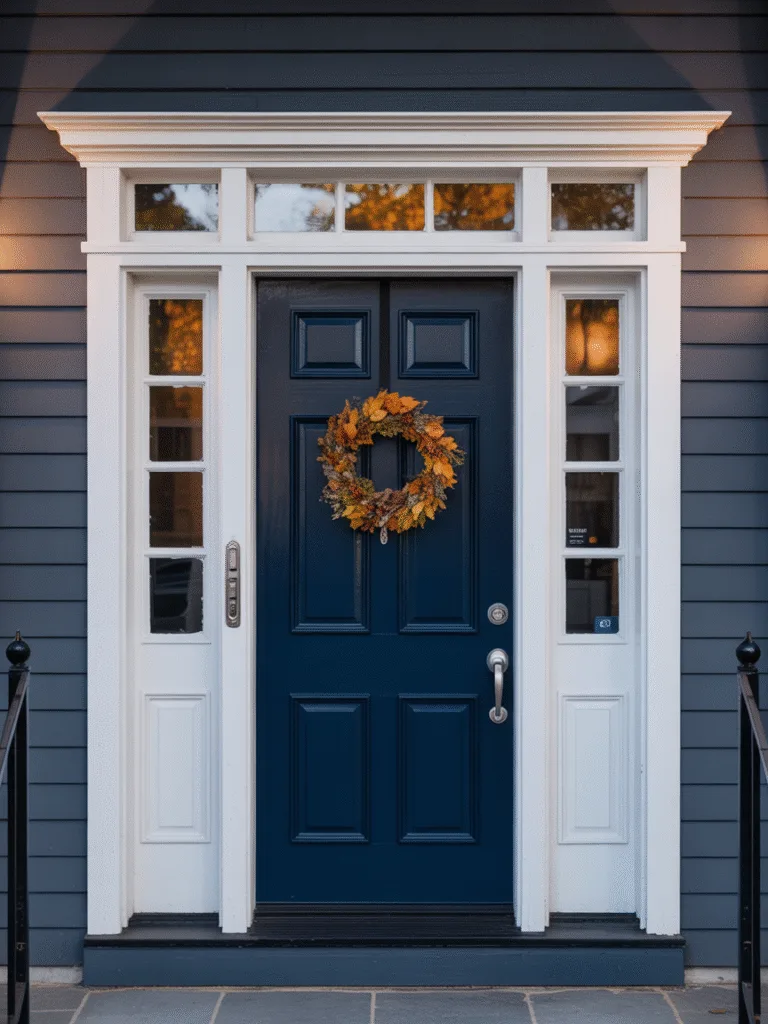
I used to think navy was “too safe”, until I tried it. Trust me, a deep navy door feels elegant, dramatic, and surprisingly cozy.
Why navy is a win:
- Less harsh than black, but still very sophisticated.
- Adds depth and contrast, without overwhelming.
- Feels modern and classic, at the same time.
Design Tips:
- Pair with brushed nickel or matte black hardware.
- Works well with both light and dark exteriors.
- A wreath or seasonal decor looks amazing against navy.
3. Bright Red
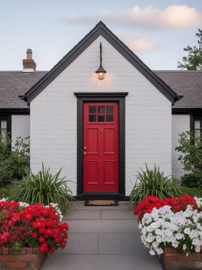
If your door needs a little drama, red’s the move. It’s the color of hospitality in some cultures and a total power statement in any neighborhood.
Why red turns heads:
- Bold and welcoming, it catches the eye immediately.
- Warm and energetic, great for traditional homes.
- Historically lucky, especially in Feng Shui beliefs.
Design Tips:
- Keep the rest of your palette neutral so the red can shine.
- Matte or satin finish works best to avoid looking too glossy.
- Deep brick red works for a more muted take.
4. Sage Green
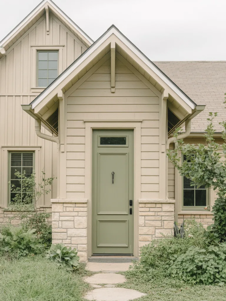
Sage is having a moment, and for good reason. It’s calming, subtle, and super friendly to earthy, boho, or farmhouse styles.
Why sage feels so fresh:
- Soft and inviting, without being boring.
- Pairs perfectly with nature-inspired elements, like wood or stone.
- Gives off relaxed, cozy vibes.
Design Tips:
- Try with a white or cream exterior for a fresh look.
- Add a simple wreath for seasonal charm.
- Bronze or black hardware adds a modern edge.
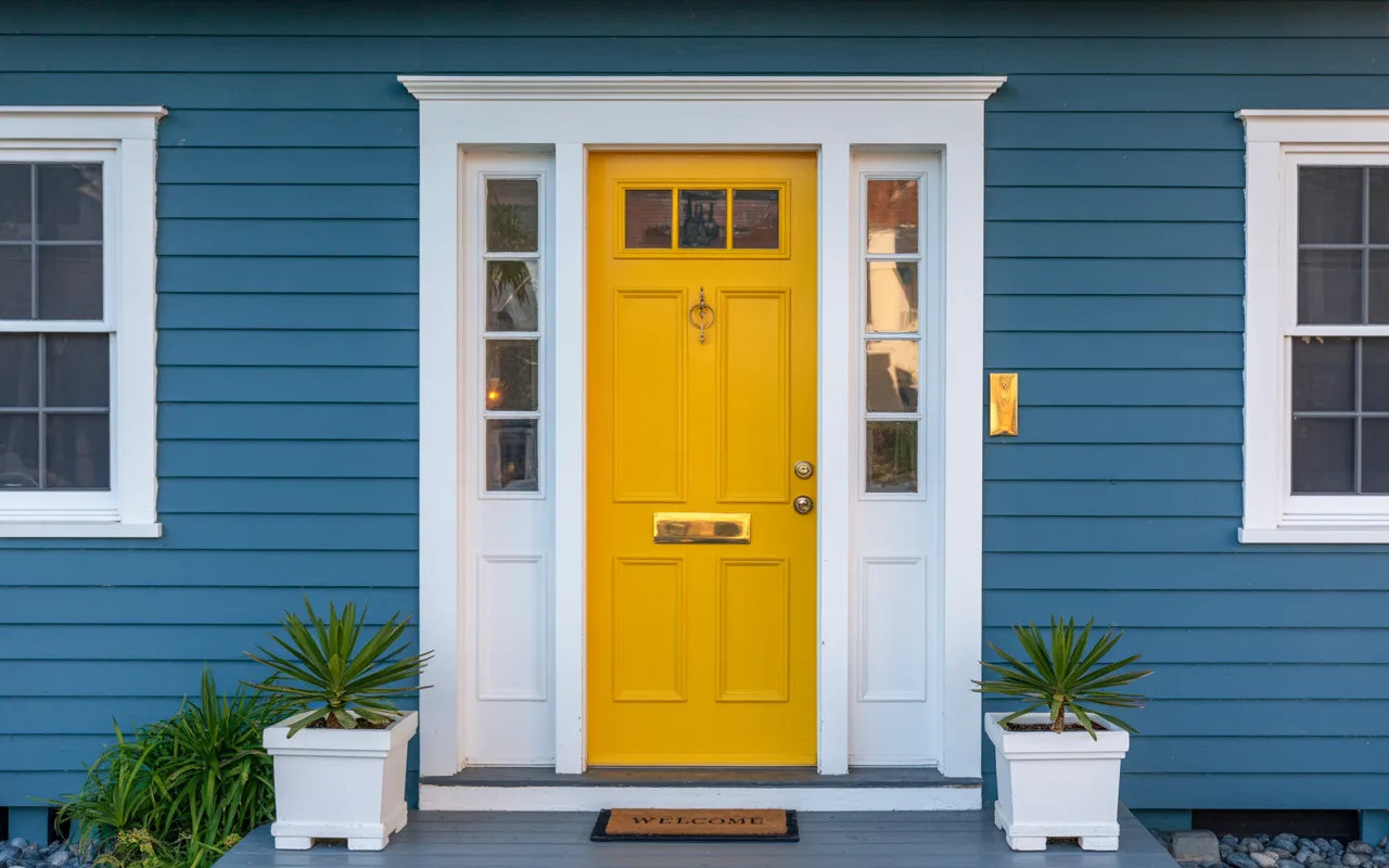
5. Sunny Yellow
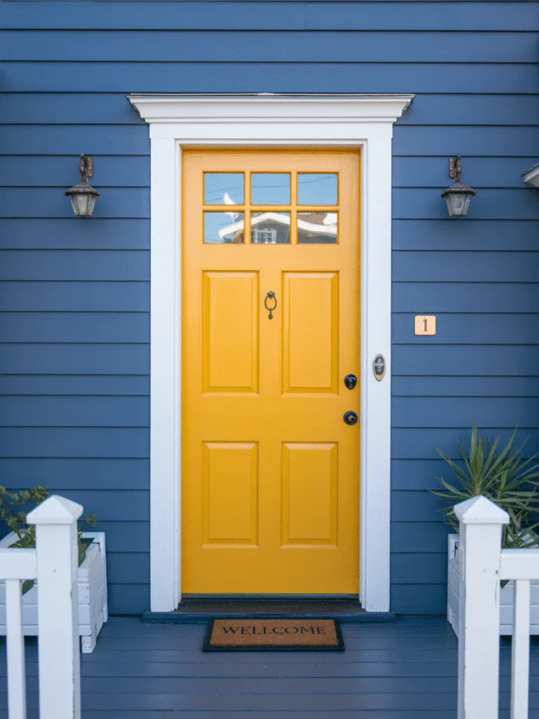
Want to radiate warmth and joy before anyone even rings the bell? Yellow doors are like a built-in welcome sign.
Why yellow rocks:
- Bright and cheerful, instantly uplifting.
- Great for coastal or craftsman-style homes.
- Unexpected but approachable
Design Tips:
- Stick with soft buttery tones for a grown-up look.
- White trim and potted plants complete the look.
- Keep other elements toned down so the yellow really glows.
6. Deep Forest Green
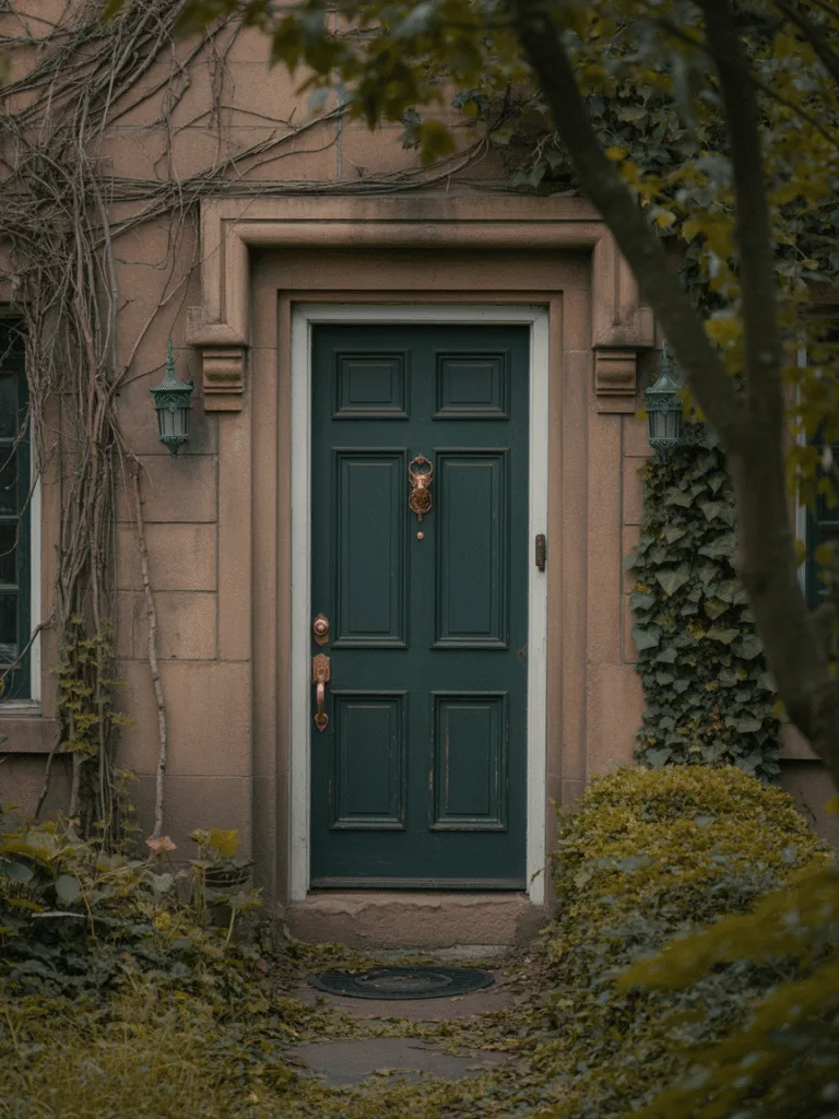
If you want a door color that feels grounded and lush, deep green is a total mood. It’s strong, moody, and cozy all in one.
Why deep green is stunning:
- Feels rich and traditional, but still very trendy.
- Looks amazing with brick, cream, or tan exteriors.
- Invites nature in, it’s soothing to look at.
Design Tips:
- Use with warm brass accents.
- A matte finish brings out its richness.
- Looks amazing surrounded by ivy or potted greens.
7. Warm Terracotta
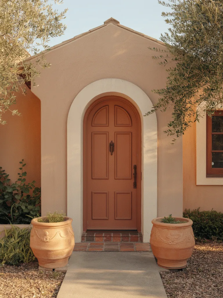
This one is such a sleeper hit. Think burnt orange meets soft clay, it’s warm, earthy, and incredibly stylish.
Why terracotta is worth trying:
- Unique but approachable
- Pairs beautifully with desert, coastal, or mid-century styles
- Feels earthy, grounded, and warm
Design Tips:
- Add copper or wood-toned accents.
- Keep surrounding paint tones neutral, think whites, tans, or soft pinks.
- Perfect for Spanish or Mediterranean-style homes.
8. Powder Blue
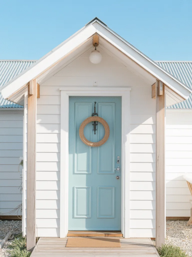
I wasn’t sure about this one at first, but oh my gosh, on a white cottage or beach house? Dreamy.
Why powder blue is a vibe:
- Soft and airy, makes everything feel lighter.
- Totally charming, and whimsical.
- Works with coastal or cottagecore looks.
Design Tips:
- Try white trim for a clean finish.
- Add brushed silver or clear glass hardware.
- Great with stone steps or porch railings.
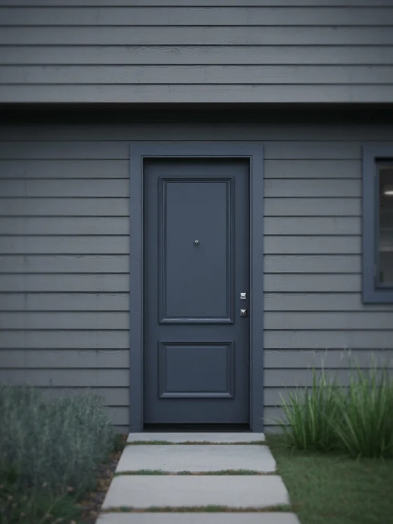
9. Charcoal Gray
When you want something modern, subtle, and just a little edgy, charcoal gray is the way to go.
Why charcoal works so well:
- Sleek and modern, without being stark.
- More forgiving than true black
- Great for minimalist or industrial homes
Design Tips:
- Pairs well with metallic finishes (like matte black or brushed chrome).
- Add some sharp landscaping or succulents for extra flair.
- Looks fantastic with wood siding or concrete steps.
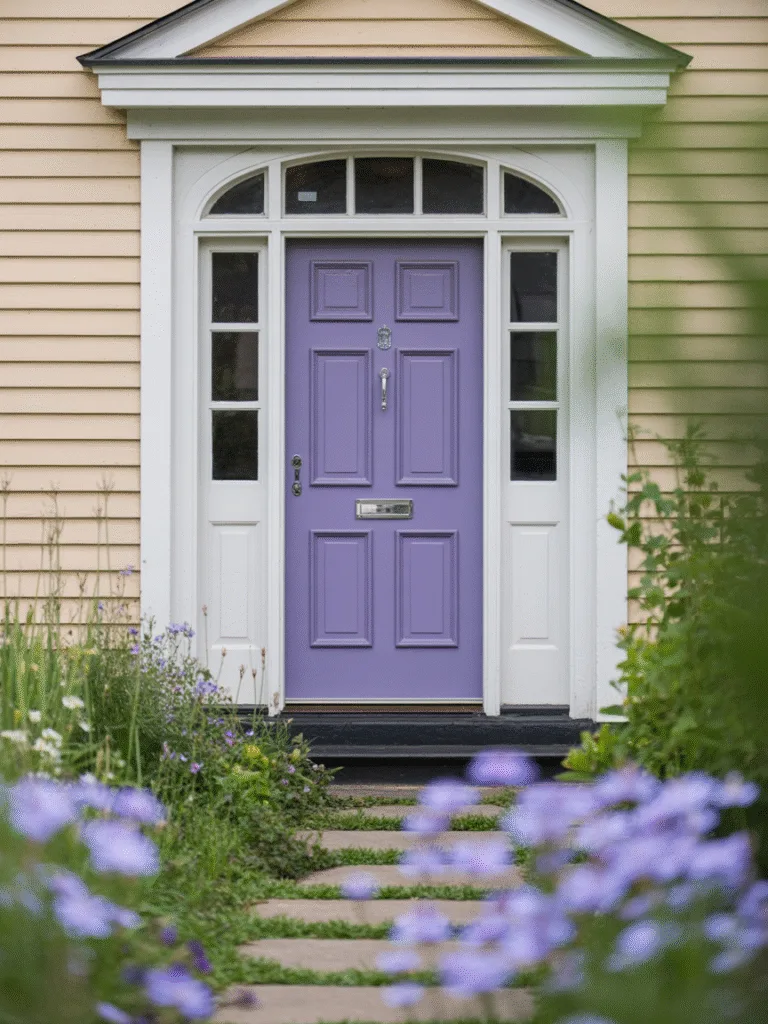
10. Lavender or Dusty Purple
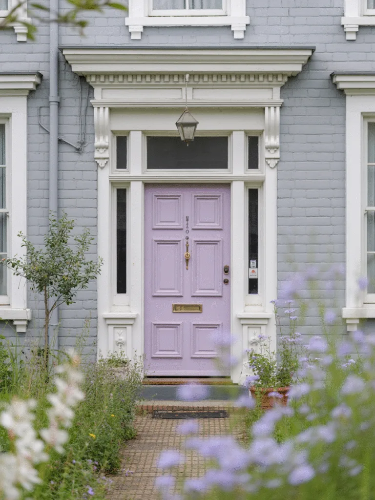
Okay, hear me out, this one’s for the dreamers. If you love a little whimsy and charm, a soft purple door can be surprisingly grown-up and elegant.
Why purple can be magic:
- Unexpected and playful, but still tasteful.
- Adds softness and charm
- Works on Victorian or whimsical cottage homes
Design Tips:
- Keep it in the dusty or muted range, not neon.
- Pair with floral accents or climbing vines.
- Works well with cool-toned exteriors like pale blue or gray.
11. Crisp White
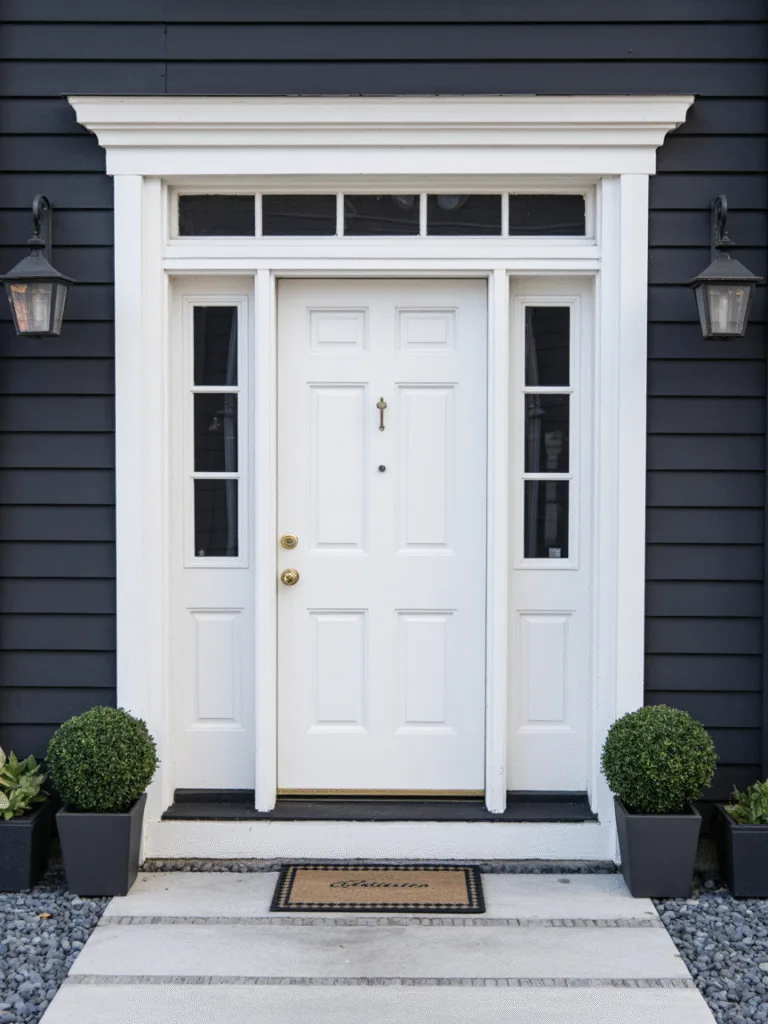
There’s something clean and polished about a white door, especially when the rest of your house has more color going on.
Why white works:
- Brightens up darker exteriors
- Super versatile and classic
- Makes trim and decor pop
Design Tips:
- Use a semi-gloss finish for easy cleaning.
- Add fun hardware for personality.
- Keep it super clean, white shows dirt fast.
12. Teal or Turquoise
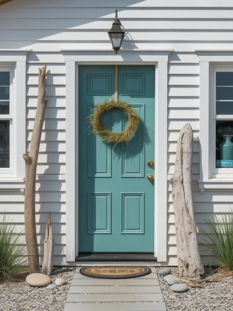
This one’s a personal fave, teal is fun, coastal, and packed with personality. It brings that vacation energy to your doorstep.
Why teal is a showstopper:
- Playful but still chic
- Pops against neutrals, like white or gray
- Feels youthful, energetic, and vibrant
Design Tips:
- Use a muted teal for a more classic look.
- Add beachy or brass accents.
- Looks amazing with white siding and wood accents.
13. Burnt Orange
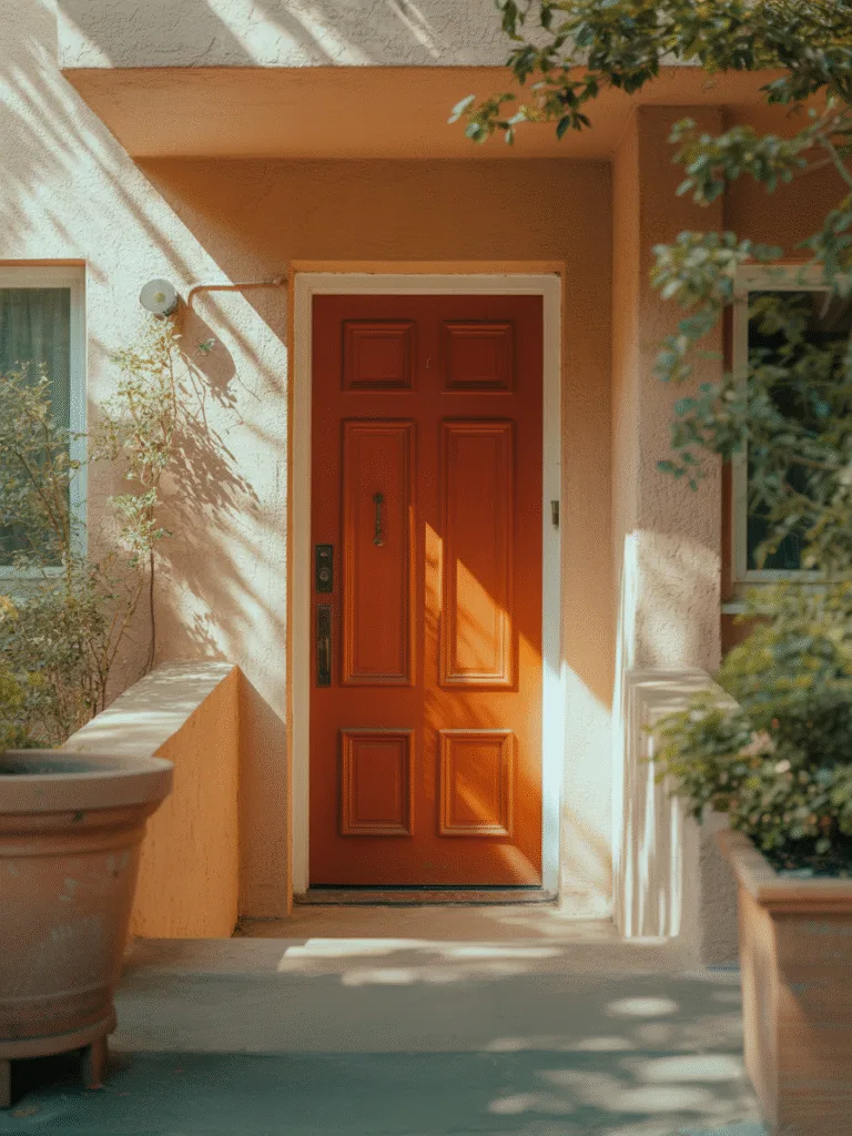
This one is for the bold souls who still want something warm and welcoming. Burnt orange is rich, earthy, and has that perfect autumn vibe year-round.
Why burnt orange makes a statement:
- Warm and spicy, without being loud.
- Adds a playful twist to neutral or modern homes.
- Feels cozy and bold at the same time.
Design Tips:
- Pair with charcoal or cream siding.
- Copper hardware really makes it pop.
- Add terra cotta planters to pull the look together.
14. Wine or Burgundy
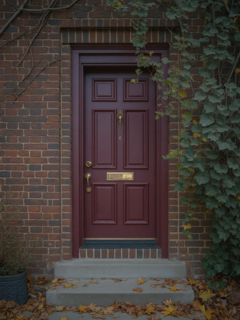
Wine-colored doors are deep, classy, and a little mysterious. It’s the red you choose when you want mature elegance over fire-engine flash.
Why wine tones are underrated:
- Elegant and dramatic, but not too flashy.
- Feels right at home on Victorian or brick houses.
- Gives a warm, romantic vibe.
Design Tips:
- Looks amazing with brass or antique bronze.
- Add topiary or hedges to accentuate.
- Keep the finish satin for a rich, velvet-like effect.
15. Pale Mint Green
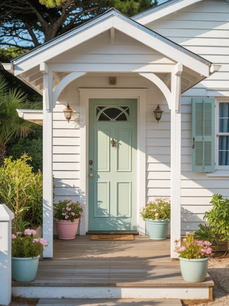
Mint might sound a little retro, but trust me, it can feel super fresh and cheerful—especially with white trim and pastel flower pots.
Why mint is minty-fresh:
- Brightens up the entrance, especially in the spring.
- Great for cottage or beachy homes.
- Feels playful, light, and unique.
Design Tips:
- Try a matte or eggshell finish for softness.
- Use white or light gray accents.
- Add hanging flowers or vines to lean into the garden vibe.
16. Chocolate Brown
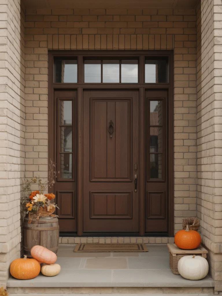
Want warmth but not too much color? Chocolate brown is a cozy classic that looks super polished without trying too hard.
Why chocolate brown works:
- Warm and grounding, like a hug in paint form.
- Perfect with natural wood, brick, or stone.
- Adds depth without going dark like black.
Design Tips:
- Pair with beige, cream, or olive green.
- Choose textured hardware like matte bronze.
- Looks amazing with fall wreaths and pumpkins.
17. Soft Peach
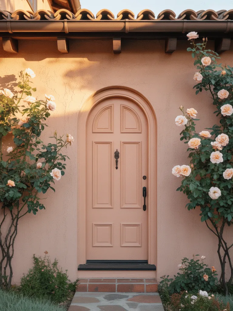
Peach might sound too fruity, but a soft, dusty peach can look absolutely charming and elegant—especially in sunnier climates.
Why peach is perfect for charm:
- Playful yet calming, perfect for inviting spaces.
- Adds a touch of romance.
- Pairs beautifully with white or coral accents.
Design Tips:
- Best with stucco or Mediterranean-style exteriors.
- Copper or brushed gold handles bring out its warmth.
- Add climbing roses or flowering plants for next-level charm.
18. Olive Green
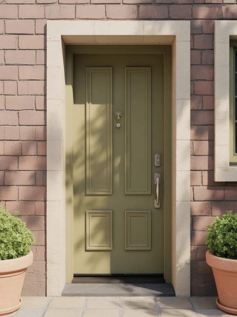
A little more toned-down than forest green, olive green has a natural, earthy feel that looks amazing with rustic or stone-heavy homes.
Why olive green is so versatile:
- Soft and organic, fits right into nature.
- Works well with neutral and warm-toned siding.
- Feels calm, collected, and beautifully understated.
Design Tips:
- Go for brushed metal accents—silver or bronze.
- Use terra cotta planters or wooden benches nearby.
- Great with beige, greige, or clay-colored siding.
19. Dusty Rose
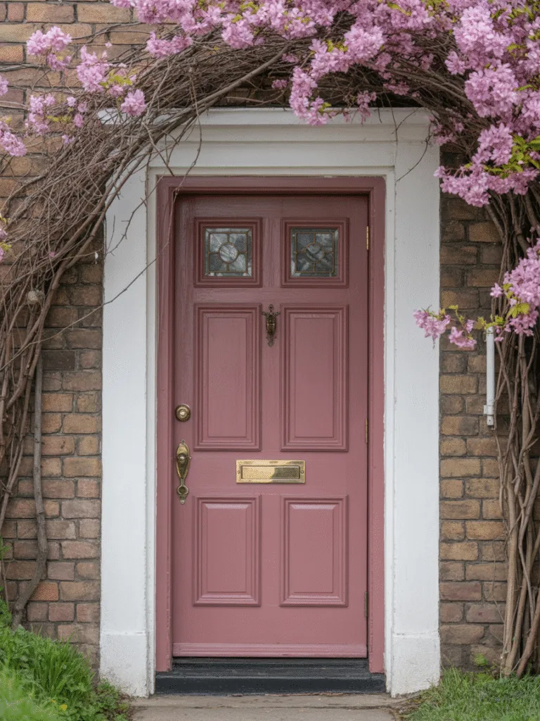
Not just for bedrooms! Dusty rose on a front door gives off major storybook cottage energy. It’s soft, sweet, and totally unexpected.
Why dusty rose is dreamy:
- Romantic and vintage, but still modern.
- Pops beautifully against stone or white walls.
- Feels gentle, welcoming, and unique.
Design Tips:
- Use brass or vintage-style knobs.
- Perfect with flowering vines or floral wreaths.
- Looks magical with cottage gardens or picket fences.
20. Sky Blue
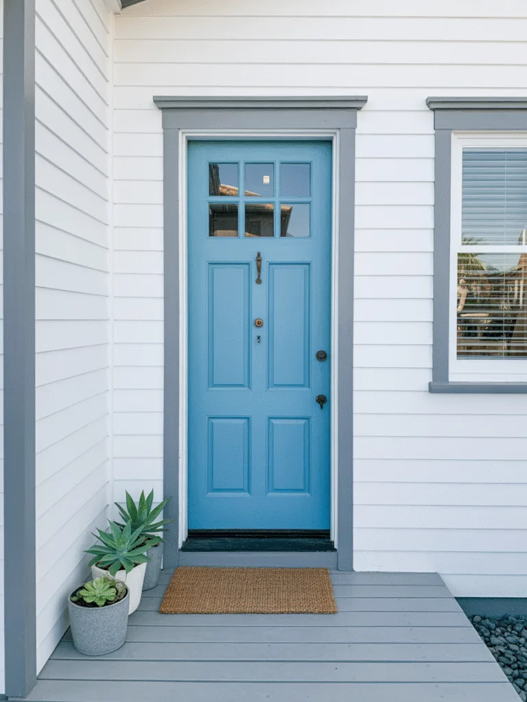
This is the kind of blue that feels like a clear day—light, breezy, and totally peaceful. It’s uplifting without being in-your-face.
Why sky blue is a breath of fresh air:
- Cheerful and calming at once.
- Ideal for beachy or cottage homes.
- Makes your entrance feel wide open and full of light.
Design Tips:
- Pair with crisp white trim.
- Add a jute doormat or sea-glass decor.
- Great with light gray or tan siding.
21. Slate Blue
If navy feels too dark and powder blue feels too soft, slate blue is that sweet spot in the middle—elegant and laid-back at the same time.
Why slate blue is balanced and beautiful:
- Understated but refined
- Pairs wonderfully with stone or wood features
- Adds just enough color to feel fresh
Design Tips:
- Go for silver or nickel hardware.
- Matte finish gives it a smooth, classic look.
- Looks beautiful with greenery or symmetrical porch plants.
22. Coral
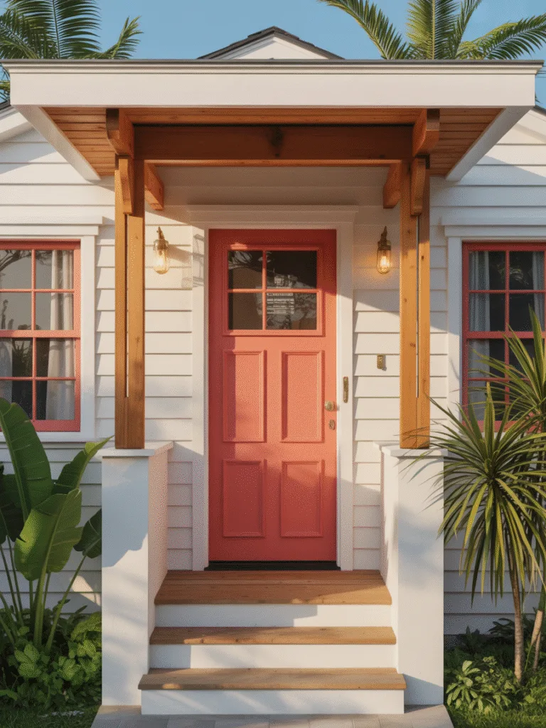
Coral is fun, bright, and completely unexpected in the best way. It gives off vacation vibes while still feeling chic.
Why coral brings energy:
- Fresh and modern, great for risk-takers.
- Pops against neutrals like beige or white.
- Feels energetic, warm, and totally tropical.
Design Tips:
- Pair with white trim and natural wood accents.
- Looks great on coastal or bungalow-style homes.
- Add hanging ferns or succulents to lean into the look.
23. Soft Taupe
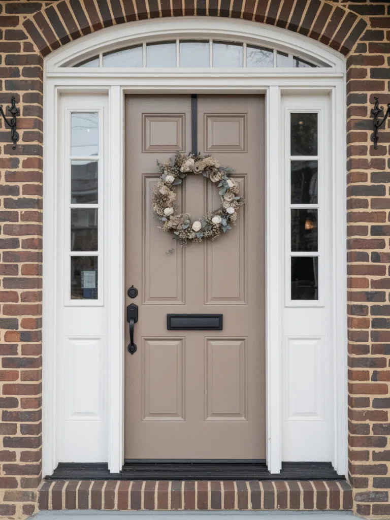
For those who like to keep it neutral but polished, taupe is a warm-toned middle ground between gray and beige that feels very grown-up.
Why taupe is timeless:
- Subtle and calming
- Works with nearly any siding color
- Adds warmth without being loud
Design Tips:
- Best with earth-toned or brick exteriors
- Choose a satin finish for low-key elegance
- Pair with black or dark bronze hardware
24. Periwinkle
Periwinkle isn’t just for spring dresses. On a front door, it’s cheerful, artistic, and a little bit whimsical—in a very intentional way.
Why periwinkle is playful and cool:
- Soft and artistic, great for creative vibes
- Has both warm and cool tones, so it works with many exteriors
- Feels lighthearted and welcoming
Design Tips:
- Best with white, cream, or pale gray siding
- Accent with silver hardware or glass panes
- Ideal for cottages or garden homes
Common Front Door Color Mistakes to Avoid
Alright, before you grab a brush, here are a few things I’ve personally messed up (so you don’t have to):
- Skipping primer, if your old color was dark and you’re going light, it’ll save you coats (and sanity).
- Too glossy, unless you’re going for glam, super high gloss can look plastic-y.
- Not testing the color, colors look way different in natural light.
- Ignoring your exterior, your door color should complement your siding, trim, and roof, not clash with them.
FAQ
What’s the best front door color for resale value?
Black and navy blue tend to perform really well for resale. They’re classic, go with most exteriors, and give a sophisticated vibe.
Should I match my front door to my shutters?
Not necessarily. It’s more about coordination, than matching. You want them to play nice together, but contrast can be a great thing.
How often should I repaint my front door?
Usually every 3–5 years, depending on your climate and the paint quality. South-facing doors may need more frequent touch-ups due to sun exposure.
Can I paint my door myself?
Yes! Just be sure to clean, sand, and prime first. Use exterior-grade paint, and you’re golden. It’s actually a pretty satisfying weekend project!
Should my front door be darker or lighter than my house?
There’s no strict rule, but as a general guide: If your house is light, go bold or dark. If your house is dark, go light or bright. The goal is contrast and balance.
Final Thoughts
Honestly, choosing a front door color is one of those small changes with huge impact. Whether you want drama, warmth, elegance, or just something new, your front door is a canvas waiting for your personality. Go bold, stay classic, or try something playful, just make it you.